XenonStack

A Stack Innovator

Post Top Ad

Saturday, 30 November 2019

11/30/2019 04:58:00 pm

Quick Guide to Benchmarking Process and Tools — XenonStack

Quick Guide to Benchmarking Process and Tools

What is Benchmarking Process?

Benchmarking process helps to measure the performance of code by running it multiple times and counting an average of vital stats. Benchmark is a tool provided by the testing package so that there is no additional dependency to get started. These benchmark functions should be prefixed by “Benchmark” followed by the function name -
func BenchmarkLoop(b *testing.B){ write code here}
Benchmark runs and displays three things -
  • Time is taken by each benchmark function available in a benchmarking file.
  • Time Taken by all the benchmark of application.
  • Reveals PASS or FAIL status for each benchmark of our application.

What is Sub-BenchMark?

Sub-Benchmark is a process in which a further benchmark function defined inside a benchmark. Benchmarkdefined inside another benchmark can be in the runnable state by using a run method code. Make a call to run method to run a benchmark written, inside another benchmark.
Example-

func BenchmarkAppendFloat(b *testing.B) { benchmarks := []struct{ name string float float64 fmt byte prec int bitSize int }{ {"Decimal", 33909, 'g', -1, 64}, {"Float", 339.7784, 'g', -1, 64}, {"Exp", -5.09e75, 'g', -1, 64}, {"NegExp", -5.11e-95, 'g', -1, 64}, {"Big", 123456789123456789123456789, 'g', -1, 64}, ... } dst := make([]byte, 30) for _, bm := range benchmarks { b.Run(bm.name, func(b *testing.B) { for i := 0; i < b.N; i++ { AppendFloat(dst[:0], bm.float, bm.fmt, bm.prec, bm.bitSize) } }) } }

Explanation of the above code
In an above code benchmark is defined and named as a “BenchmarkAppendFloat”.
Then further sub benchmark is defined inside a benchmark like as -
b.Run(bm.name, func(b *testing.B)
This sub benchmark is making use of values defined in a benchmark to execute a sub-benchmark. To execute sub benchmarks, these are as same as benchmarks. When the main benchmark method runs, the sub benchmarks defined in the main benchmark method will run automatically. When BenchMark runs, then the sub benchmark will run for each mentioned value defined in the primary benchmark.
The following command can be used to run these -
go test -bench=.
After execution of sub benchmark by using the above command, the result will appear in the following format. The result is visible as above. The main benefit of using a sub-benchmark is the elimination of writing different benchmarks to execute benchmarks with different values. Write a single benchmark and run this benchmark with any number of benefits by using the concept of sub benchmark.

Measurement of benchmark

Basically, by default benchmark executed by nanoseconds and can also change this benchmarking execution time mentioned below. Benchmark implemented by following parameters and can define a benchmark time in a different format while executing code.

Benefits of Enabling Benchmarking Process

  • It helps to check that how much amount of memory defined method talking(method defined in form of BenchMarking).
  • It helps to check that how much amount of CPU iteration our system is taking.
  • While using BenchMarking, it can also be defined in how much amount of memory defined method should run.
  • Usage of BenchMarking process will be cleared more by reading complete documentation.

How Benchmarking Process Works?

Write Code in the form of functions according to requirements.
Write BenchMarks for written methods of code in the file with extension
Filename_test.go.
Test all the BenchMark present in the file for functions of code go test -bench=.
Test all the BenchMarks present in the file along with Memory and CPU Profiling for functions of code.

Go test -run =. -bench = .cpuprofile = cpu.out -benchmem - memprofile = mem.out.
  • After execution of the above command result for CPU Profiling will store in a cpu.out and result for Memory Profiling will get stored in mem.out.
  • Execution of the following command helps to access the content of cpu.out and mem.out file.
  • Execute go tool pprof cpu.out for CPU Profiling.
  • Execute go tool pprof mem.out for Memory Profiling.

How to Adopt BenchMarking?

Steps to be followed to write benchmarks or sub benchmarks -
  • The code runs correctly without defining the primary file in the project.
  • Write a benchmarking function in a separate file for functions defined in a project.
  • But there is a condition that this benchmark file saved with “ _test” in the end.
  • “Filename_test.go”
Benchmarks method contains a signature in the following format -
func BenchmarkLoop(b *testing.B){ write code here}
After that, we can run a benchmarking for project code by using the following command -
go test -bench=.
After execution of code by using the above command, the result will be available in the following format
Commands to execute benchmarks -
CPU profiling and memory profiling on our code along with benchmarking by using following steps -
  • Write code according to requirements.
  • Then go to the specific location to run a code, where code placed.
  • Then after this run the following command.
go test -run=. -bench=. -cpuprofile=cpu.out -benchman -memprofile=mem.out -trace trace.out

Explanation of result -
  • The first row containing the name of the method.
  • The second row contains many iterations.
  • The third parameter contains the value that how much each benchmark uses CPU resource.
  • The last column represents how much memory allocated to each method in the form of bytes.
  • The last column represents how much memory allocated to each method in the form of bytes.
  • Add the following line of code to perform memory profiling results along with CPU profiling.
  • b.ReportAllocs()
The last two columns in the above screenshot representing a memory regarding information. These previous two columns in a screenshot are visible only because the above line of code is added within the code. If the above line of code not inserted into code then a last two columns in output are not visible.
Allocate static memory for the code -
To run a code/function with some defined memory requirements. Define the amount of memory within a function. Following the line of code can be added inside the function to allocate some specific resource for the code.
b.SetBytes(2)

Benefits of Benchmarking Process

  • It helps to check that amount of memory defined.
  • It helps to check that how much amount of CPU iteration system takes.
  • BenchMarking determines how much amount of memory defined method should run.
  • Improved Productivity
  • Improved Performance
  • Impact Analysis
  • Process Intelligence
  • Community Intelligence
  • Quantitative and Quantitative approaches

Best Practises of Benchmarking

  • Cloning of the project
  • Adhere to standard and meaningful metrics
  • Improve Operations
  • Have a deadline
  • Strategic Alignment and Assessment
  • Team Management
  • Great Decision-Making
  • Determine Process and gather data
  • Limit Server connections
  • Analysis of gaps and Improvement
  • Determine Future Trends
  • Reveal Results
  • Implementation of plans and Result Monitoring
  • Continuous Evaluation of Benchmarks
11/30/2019 04:51:00 pm

Stream Analytics Architecture and Tools for IoT — Xenonstack
A few years ago, we remembered the time when it was just impossible to analyze petabytes of data. The emergence of Hadoop made it possible to run analytical queries on our vast amount of historical data.
As we know, Big Data is a buzz from the last few years, but Modern Data Pipelines are always receiving data at a high ingestion rate. So this constant flow of data at high velocity is termed as Fast Data.
So Fast data is not about just volume of data like Data Warehouses in which data is measured in GigaBytes, TeraBytes or PetaBytes. Instead, we measure volume but concerning its incoming rate like MB per second, GB per hour, TB per day. So Volume and Velocity both are considered while talking about Fast Data.

Stream Analytics Architecture

Nowadays, there are a lot of Data Processing platforms available to process data from our ingestion platforms. Some support streaming of data and other supports real streaming of data which is also called Real-Time data.
Streaming means when we can process the data at the instant as it arrives and then processing and analyzing it at ingestion time. But in streaming, we can consider some amount of delay in streaming data from ingestion layer.
But Real-time data needs to have tight deadlines regarding time. So we usually believe that if our platform can capture any event within 1 ms, then we call it real-time data or real streaming.
But When we talk about taking business decisions, detecting frauds and analyzing real-time logs and predicting errors in real-time, all these scenarios comes to streaming. So Data received instantly as it arrives termed as Real-time data.

Stream Analytics Tools & Frameworks

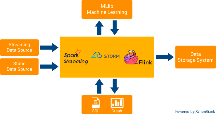
So in the market, there are a lot of open sources technologies available like Apache Kafka in which we can ingest data at millions of messages per sec. Also Analyzing Constant Streams of data is also made possible by Apache Spark Streaming, Apache Flink, Apache Storm.
Apache Spark Streaming is the tool in which we specify the time-based window to stream data from our message queue. So it does not process every message individually. We can call it as the processing of real streams in micro batches.
Whereas Apache Storm and Apache Flink can stream data in real-time.

Why Stream Analytics?

As we know that Hadoop, S3 and other distributed file systems are supporting data processing in huge volumes and also we can query them using their different frameworks like Hive which uses MapReduce as their execution engine.

Why we Need Real-Time Streaming?

A lot of organizations are trying to collect as much data as they can regarding their products, services or even their organizational activities like tracking employees activities through various methods used like log tracking, taking screenshots at regular intervals.
So Data Engineering allows us to convert this data into basic formats and Data Analysts then turn this data into useful results which can help the organization to improve their customer experiences and also boost their employee’s productivity.
But when we talk about log analytics, fraud detection or real-time analytics, this is not the way we want our data to be processed. The actual value data is in processing or acting upon it at the instant it receives.
Imagine we have a data warehouse like hive having petabytes of data in it. But it allows us to just analyze our historical data and predict future.
So processing of huge volumes of data is not enough. We need to process them in real-time so that any organization can take business decisionsimmediately whenever an important event occurs. This is required in Intelligence and surveillance systems, fraud detection etc.
Earlier handling of these constant streams of data at high ingestion rate is managed by firstly storing the data and then running analytics on it.
But organizations are looking for the platforms where they can look into business insights in real-time and act upon them in real-time.
Alerting platforms are also built on the top of these real-time streams. But the Effectiveness of these platform lies in the fact that how honestly we are processing the data in real-time.

Use Of Reactive Programming & Functional Programming

Now when we are thinking of building our alerting platforms, anomaly detection engines etc. on the top of our real-time data, it is vital to consider the style of programming you are following.
Nowadays, Reactive Programming and Functional Programming are at their boom.

What is Reactive Programming?

So, we can consider Reactive Programming as subscriber and publisher pattern. Often, we see the column on almost every website where we can subscribe to their newsletter, and whenever the newsletter is posted by the editor, whosoever have got subscription will get the newsletter via email or some other way. So the difference between Reactive and Traditional Programming is that the data is available to the subscriber as soon as it receives. And it is made possible by using Reactive Programming model. In Reactive Programming, whenever any events occur, there are certain components (classes) that had registered to that event. So instead of invoking target elements by event generator, all targets automatically get triggered whenever an event occurs.

What is Functional Programming?

Now when we are processing data at high rate, concurrency is the point of concern. So the performance of our analytics job highly depends upon memory allocation/deallocation. So in Functional Programming, we don’t need to initialize loops/iterators on our own.
We will be using Functional Programming styles to iterate over the data in which CPU itself takes care of allocation and deallocation of data and also makes the best use of memory which results in better concurrency or parallelism.

Stream Processing and Analytics in Big Data

While Streaming and Analyzing the real-time data, there are chances that some messages can be missed or in short, the problem is how we can handle data errors.
So, there are two types of architectures which are used while building real-time pipelines.
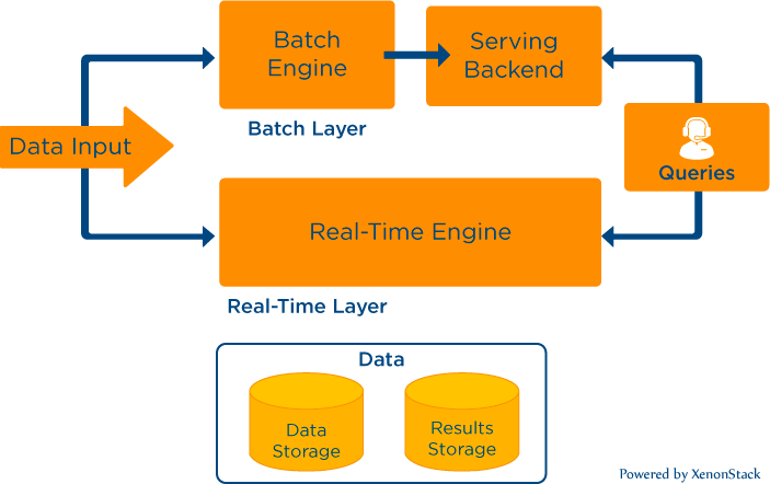
This architecture was introduced by Nathan Marz in which we have three layers to provide real-time streaming and compensate any data error occurs if any. The three layers are Batch Layer, Speed layer, and Serving Layer.
So data is routed to the batch layer and speed layer by our data collector concurrently. So Hadoop is our batch layer, and Apache Storm is our speed layer. And NoSQL data store like Cassandra, MongoDB is our serving layer in which analyzed results will be stored.
So the idea behind these layers was that the seed layer would be providing real-time results into serving layer and if any data errors or any data is missed while stream processing, then batches job will compensate that and the MapReduce job will run at the regular interval and updates our serving layer, so providing accurate results.
Now The above Lambda architecture solves our problem for data error and also provide flexibility to provide real-time and accurate results to the user.
But Apache Kafka founders raise the question on this Lambda architecture, they loved the benefits provided by the lambda architecture, but they also state that it is tough to build the pipeline and maintain analysis logic in both batch and speed layer.
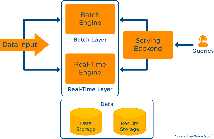
So If we use frameworks like Apache spark streaming, Flink, Beam they provide support for both batch and real-time streaming. So it will be straightforward for developers to maintain the logical part of the data pipeline.

Stream Processing and Analytics For IoT

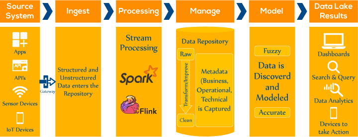
Internet of things is a very hot topic these days. So numerous efforts are going on to connect devices to the web or a network. In short, we should be monitoring our remote IoT devices from our dashboards. IoT Devices includes sensors, washing machines, car engines, coffee makers etc. and it almost covers every machinery/electronic device you can think.
So let’s say we were building a retail product in which we need to provide real-time alerts to organizations regarding their electricity consumption by their meters. So there were thousands of sensors, and our data collector was ingesting data at a very high rate, I mean in millions of events per second.
So Alerting platforms need to provide real-time monitoring and alerts to the organization regarding the sensors status/usage.
To meet these requirements, Our platform should provide real-time streaming of data and also ensure the accuracy of results.

Processing Fast Data

As I explained earlier that Kappa architecture is getting very popular these days to process data with less overhead and more flexibility.
So, Our Data Pipeline should be able to handle data of any size and at any velocity. The platform should be intelligent enough to scale up and down automatically according to load on the data pipeline.
I remember a use case where we were building a Data Pipeline for a Data Science Company in which their data sources were various websites, mobile devices, and even raw files.
The main challenge we faced while building that pipeline was that data was coming at a variable rate and also some raw files were too big.
Then we realize that to support random data incoming rates we need an automated way to detect the load on the server and scale it up/down accordingly.
Also, we built a Customs Collector in which support files are in GB or even TB’s. So Idea behind that was the auto-buffering mechanism. We keep on varying our minimum and maximum buffer size depending on the scale of the raw file we receive.

Conclusion

Real-time data streaming operates by creating use of constant queries that work on time and buffer windows. However, if we compare it with traditional database model where data was used to stored and indexed for further processing, it is totally opposite to it. Real-time data streaming does use of data while in motion within the server. To know more about real-time streaming data, you are advised to look into the two steps:

Friday, 29 November 2019

11/29/2019 05:14:00 pm

Large Data Processing with Presto and Apache Hive — XenonStack


Building Query Platform with Presto and Apache Hive

Distributed SQL Query Engine Presto runs analytic queries. Infrastructure Automation implemented using Ansible and Terraform for Auto Launching, Auto Scaling and Auto Healing of the Presto Cluster and Hive using AWS On-Demand EC2 and AWS Spot Instances.

Presto has the following Features

  • Presto queries data in Hive metastore and optimized for latency.
  • Presto has Push Data Processing Models like traditional DBMS implementations.
  • Presto includes memory limitation for query Tasks and runs daily /weekly reports queries Required a Large Amount of Memory.

Apache Hive Features

  • Hive runs Batch Processing against data sources of all sizes ranging from Gigabytes to Petabytes.
  • Hive optimized for query throughput.
  • Hive has Pull Data Processing Modelling.

Top Business Challenge for Big Data Processing

  • Build Data Processing & Query Platform and Cluster Management.
  • Large DataSets on remote storage and use Presto for data discovery and Apache Hive, Tez For ETL Jobs.
  • Infrastructure Automation for Cluster Management and deployment for Presto and Hive using AWS Spot Instances.

Solution Offerings for Infrastructure Automation

  • Simplify, Speed Up and Scale Big Data Analytics workloads.
  • Process Data from external storage using fast execution engines like Presto and Hive.
  • Run large and complex queries.
  • Cost-effective using AWS spot instances as default and heal the cluster if cluster scale is smaller than the minimum cluster size.
  • Automatic Scale Up and Down the cluster according to the CPU load.

11/29/2019 04:51:00 pm

D3.js Library Overview, Best D3.js Use Cases — XenonStack


What is D3.js?


D3.js stands for Data-Driven Documents is a front-end visualization library in javascript for creating interactive and dynamic web-based data visualizations, it also has an active community behind it for which it is very famous. It uses HTML, CSS a, and SVG to bring data to life and mainly it is for manipulating DOM objects, focusing on objects and concepts, not just the pre-built charts and graphs. It is mostly compatible with popular web browsers, like Chrome or Firefox.
It can even create different shapes arcs, lines, arcs, rectangles, and points. The essential feature of d3.js that it provides the beautiful fully customized visualizations. It is a suite of small modules for data visualization and analysis. These modules work well together, but we should pick and choose the parts that we only need. D3's most complex concept is selections and if we are using a virtual DOM framework like React (and don’t need transitions), so don’t need selections at all.

A basic Introduction how to use d3.js?


So, we need to create a visualization with d3, set up workspace inside a container, create x and y-axes, process data and draw graphs and charts using functions. We can also add different attributes and styles for datapoints or lines. When creating basic charts and graphs, D3 is not complicated, for customization need to add more code. More complex visualizations need lots of logic, layouts, and data formatting as these are the keys that we want our visualization to speak for.
D3 also can be paired with a WebGL library, which makes more standard capabilities regarding dynamic and interactiveness. We can even animate one element, based on transitions similar to those done in CSS.

Why we use D3.js?


Today different kind of charting libraries and BI tools are available for creating visualizations, so the question arises why to use d3.js for creating visualizations, because of its key features versatility, full customization, and interactive visualization, even the exactly the data visualization that can be made by graphic designers.
Data visualization is very hard then we think. It is easy to draw shapes, but sometimes visualizations require full customization such as a need to bring subtle ticks and different smooth curves between data points. That is where d3.js comes in that allows us to explore the design space quickly. It is also not only a charting library but acts as a versatile coding environment that can be best used for making complex visualizations.

When to use D3.js?


As d3.js becomes complicated sometimes, programming in d3 should
 be done from scratch and requires a steep learning curve, but due to its significant advantages, we need to use it and get to decide when to use that library. We should use D3.js when our web application is interacting with data. We can explore D3.js for its graphing capabilities and make it more usable. It can be added to the front end of our web application as the backend server will generate the data and front-end part of the application where the user interacts with data use D3.js.

Some of the use cases of D3.js

We above discussed about data visualization basics, d3.js front-end visualization library concepts, where and when to approach d3.js library, now go through some of the use cases of d3 as d3 with complex code also provide reusable code that can be used again in other visualizations, d3 also can be used to react, storytelling with customized and visualizations the most crucial use case can also be achieved with d3. Some of the use cases of the d3 library are discussed below:

Reusable charts with D3.js

During creating visualizations, we also need to take care of reusability of the charts or anything that made in visualization. Let’s discuss how D3.js library provide the reusable charts, and firstly we should know what can be a reusable chart, some of the characteristics that a reusable chart has -
Built charts in an independent way -
We need to make all chart elements associated with data points of the dataset independently. This has to do with the way D3 associates data instances with DOM elements.
  • Repeatable — Instantiate the chart more than one time, as chart visualizing chart with different datasets.
  • Modifiable — Source code of charts can be easily be refactored by other developers according to different needs.
Configurable
We need to modify only the appearance and behavior of the graph without changing the code.

Some of the best practices to make reusable charts with d3.js

Built charts in an independent way
To make the chart reusable with d3.js, it should be repeatable, modifiable, configurable and extensible.
To make chart repeatable in d3.js we can use the object-oriented property and approach chart.prototype.render and also use this property during a call the functions.
To make the modifiable chart make source code with simple transformations with d3.js built-in functions, so that path to modification in the system becomes clear and easy to be modified by the other developers.
Easy modification path can be achieved by using various selection functions .enter(), .exit() and .transition().
enter() selection — When a dataset contains more items than the DOM elements, data items stored in entering the selection.
For example -
We need to make some modification to our dataset. We add one more data item to the array, as our bar chart contains still only four bars of data, that time choose data element from entering the selection.
A room visualization, with several chairs that are DOM elements and guests that are data items, sit on the chairs which are data joined with DOM elements. The enter selection in the waiting area for data items that enter the room but cannot be seated, as there are not enough chairs. As to arrange more chairs, where to create new bar div and add it to DOM is what done by d3 selector enter.
exit() selection — As we discuss how we could add new items to a data set dynamically and update the visualization. In the same way, we can remove items from the data set and allow D3 deal with the corresponding DOM elements or, following our room/chair method, take away those chairs that are not needed anymore because some guests decided to leave. The exit selection does this. It contains only those data items that are about to leave the data set.
Configurable -
Consider the visualization of the bubble chart, to make it reusable, only the size of the chart and input dataset needs to be customized.
Define Size of the chart
1 var bubbleChart = function () { 2 var width = 500, 3 height = 500; 4 function bubblechart(select){ 5 } 6 return chart; 7 }
We want to create charts of different sizes without the need to change the code. Create the charts as follows
1 bubble.html 1 var chart = bubbleChart().width(500).height(500);
Now we will define accessors for the width and height variables in the bubble_chart.js file -
1 // bubble_chart.js 2 var bubbleChart = function () { 3 var width = 500 4 height = 500; 5 function chart(select){ 6 } 7 chart.width = function(val) { 8 if (!argu.len) { return width; } 9 width = val; 10 return chart; 11 } 12 chart.height = function(val) { 13 if (!argu.len) { return height; } 14 height = val; 15 return chart; 16 } 17 return chart; 18 }

Role of Data Visualization in D3.js

Over the last few years, data visualization growing more and more in a day to day experience. We see data visualization daily in our social media, news articles and every day at work. Data visualization is that it translates quantitative data into graphic representations using libraries i.e D3.js Library. Data visualization includes tasks of designing, creating and deploying is not just a single profession at all but shows a combination of work of designers, analysts, engineers, and journalists. As for data visualization tasks engineers use different javascript libraries, and analysts use various business intelligence tools.
Nowadays we able to collect and analyze more and more data than ever before. Big data is a hot topic even now and a major to study. But to be able to understand and digest all these kind of numbers, we need visualization and a platform or framework that makes all kinds of visualizations possible, no matter how much data there is need to process, that’s where d3.js and other visualizations tools come in.
Only plotting the charts with visualization libraries and tools is not enough; we need storytelling art here also. As most of the libraries and tools exist here not provides the effective display of quantitative information, where D3.js most successful library comes in that already tells half of the story when we start developing the code for it.

Data Visualization using D3.js with React

As D3 enter, exit and update pattern provides full control to the developer for managing the DOM. We can manage when should element is added to the screen and when it is removed and how to update the element. It is working fine when the updates of data elements are simple, but it gets complex when there exists a lot of data elements to keep track of, and the data elements to update vary from one user action to another. One solution to manage the DOM data elements is manually counted which elements require updates, but it also becomes complex we could not keep the count in our heads, as that is manually defining the DOM tree which is not recommended, so there is need to integrate react and D3 together for complex visualizations.
As react that updates virtual DOM are exactly like D3 enter, exit and update pattern. So let’s use d3 with react, react for what to enter and exit operations and d3 for update patterns. Discuss react with d3 implementation in a few steps -

Enter and Exit pattern with React

React follows the concept of dynamic children (reuse code between components and inheritance) that is similar to D3 data binding property. It allows passing in a key per children to track order of children as like vital function pass into d3.data and uses that to calculate what should be added and removed when data changes.
Consider the example here as we need to render two rectangles, and a text element with D3, code for it in D3 looks like below -
1 var graph = d3.select('svg').append('g') 2 .class('graph', true); 3 var expenses_graph = graph.selectAll('g.expense'); 4 var enter_ele = expenses_graph 5 .data(expensesData, (expense_graph) => expense_graph.id) 6 .enter().append('g') 7 .class('expense_graph', true); 8 enter_ele.append('rect') 9 .class('expenseRect', true); 10 enter_ele.append('text'); 11 expenses.exit().remove();
Now, integrate the d3 code with react components, that is like -
1 class ExpenseComponent extends React.Component { 2 render() { 3 return ( 4 ); 5 } 6 } 7 class GraphComponent extends React.Component { 8 render() { 9 var expenses_graph = expensesData && expensesData.map((expense) => { 10 return (); 11 }); 12 return ( 13 {expenses_graph} 14 ); 15 }
Firstly when we see the react code, it looks complicated, but it also provides some great things such as -
It allows us to make components for elements, so it becomes easier to reuse code, that kind of reusability code also done in old D3 code, but react makes it explicit.
It allows us to keep track of what components looks like and reflect the structure of the DOM.
Another thing that can be achieved with it is we do not need to think about entering and exiting again. When we show and hide parts of component depend on data, with react will only draw only the elements that we need, when we need it accordingly in a straight manner, the below code in react will show -
1 class ExpComponent extends React.Component { 2 render() { 3 return ( 4 {this.props.data.name && ()} 5 {this.props.data.name && ()} 6 ); 7 } 8 }

Updating and transitioning with D3

With entering and exit selections we have a structure of the components, need to fill in the attributes.D3 also manage to update the attributes.In React component, call the enter code from component(), and update code from update(). In this way, as soon as the elements are inserted into the DOM, we can use D3 to set the starting attributes, when data changes, we will use D3 transition patterns the element to next set of attributes. We should also keep in mind whatever the react keep tracking of d3 cannot manipulate it.
So the update and transition pattern help to keep make ownership between these two, where React manages the structure and D3 helps in maintains the attributes. In that way, D3 will transition elements update its positions, its fill color and update its size all things without conflicting with react workflow.

Storytelling with d3.js interactive visualizations

We will discuss the d3.js library, its features, why we need it and reusability. As we need to keep in mind the target audience when made any visualization, because our task is not only to rendered visualization, but it should be fully explainable, our approached audience can understand it wisely, so how the audience can understand it, that can be only achieved with storytelling. D3.js interactive and beautiful visualizations help in the fantastic narration of data. Let’s discuss the chord diagrams complex visualization in a different interactive way and see how it helps in storytelling -
Consider the problem here, as all people in India are using phones, many will switch to a new phone after some time, a question arises how do users change and how this differs per brand, these kinds of different problems can be answered by visualizing the dataset by using chord diagrams visualization in d3.js.
The below chord diagram shows the relationship in terms of switching behavior between different phone brands. The circle is divided into eight brands — the arc length of every group shows brand market share. The outer side rim of the chord diagram shows a percentage per brand. It indicates that Samsung shares 38%, Apple on second with share 19% and Nokia on third with a 16% share. The chords are directed in a diagram as 8.7% of users who now have Samsung, used to have Nokia, only 1.2% opposite. The chords placed between the arcs visualizes users switching behavior between all brands in both directions.
For example, the blue chord that connecting Samsung and Nokia in the left section shows the users that moved from Samsung to Nokia and from Nokia to Samsung. The visualization shows that Nokia lost its share to Samsung, as 8.7% of all users that used Nokia now own Samsung.

Insights from a mobile consumer survey chord diagram visualization

When we made the customized visualization visualizing the flow of brands, come to more conclusions and insights that are discussed below -
  • Both Apple and Samsung brands are capturing users from Nokia and Other Brands.
  • Only a few users losing by Apple, the number of users gained is twice the number of users lost.
  • HTC brand is acquiring users from Nokia, LG brand and losing users to Samsung and Huawei brand.
  • Nokia brand acquiring more users than it loses the users.

Approaches to Data Visualization

Data visualization helps users to translate quantitative data into graphic representations using leading Data Visualization Techniques. To know more about Data Visualization we recommend taking the following steps -